Design System Starter - Ship a Usable System in 7-10 Days
Your product doesn't need a 200-page design bible. It needs a repeatable set of decisions: colors, type, spacing, and a few components everyone uses the same way. This starter shows you how to build that - fast.
What to do next
- Audit existing UI and pick the winning patterns.
- Create a token base (color, type, spacing, radius, elevation).
- Define 8-10 core components you'll actually reuse.
- Document usage and states in your design tool.
- Share with product/engineering and enforce in new work.
Why WisGrowth cares: good systems reduce rework, make teams faster, and let you focus on high-value work - which is exactly how you grow your career.
Let's make this a shipping project, not a forever project.
Quick answer
Design System Starter - Ship a Usable System in 7-10 Days is for a real career decision, not a motivational label or a personality verdict.
Use it when you are weighing a role, study path, application direction, course, or reset and need to see fit, risk, proof gaps, and one next step.
The useful move is small and concrete: test the assumption that matters most before committing more time, money, applications, or confidence.
Checklist
- Write the decision in one sentence instead of trying to solve your whole career.
- List the evidence you already have about fit, energy, money, and risk.
- Find the proof gap that makes the next move feel unsafe.
- Run one small test before making the move bigger or more expensive.
What this page helps you decide
What direction should I explore next?
Career clarity improves when you compare realistic options and test one next step instead of waiting for a perfect answer.
- Notice the patterns in energy, skills, constraints, and proof.
- Compare a few options without forcing one dramatic answer.
- Pick one low-risk test that gives better evidence this week.
This page is a starting point for clearer direction, not a one-time verdict.
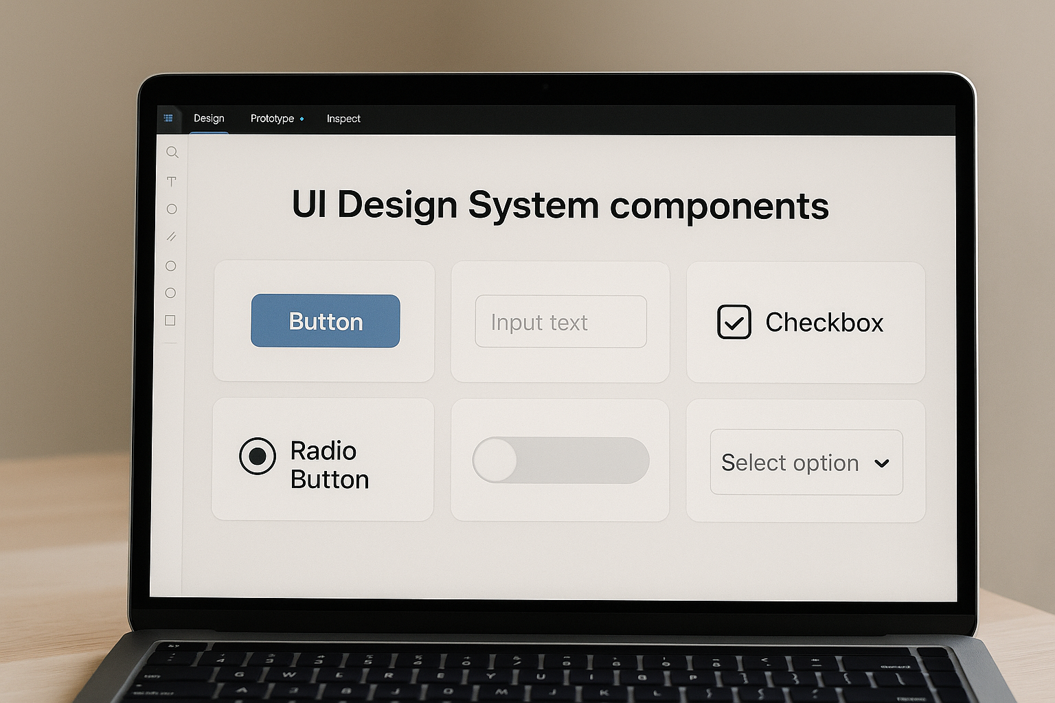
What is a Design System Starter?
It's the minimum set of design rules and reusable parts that keeps your product consistent. Not a full "design ops" program. Not a giant figjam. Just enough structure to stop "Which button are we using?" discussions.
Think of it as an MVP design system you can grow later.
Why it matters (especially for small teams)
- Faster shipping: Designers stop redesigning buttons; devs stop guessing.
- Consistent UX: Users see the same patterns less friction.
- Easier onboarding: New hires get a single source of truth.
- Career proof: "I built a system the team actually used" is a strong portfolio story.
If you're building your product and career in parallel, this is a great artifact to show in interviews. Pair it with a 7-Day Proof Sprint and you've got a solid case study.
How to build it in 7-10 days (step by step)
- Day 1-2: Audit & choose. Screenshot current UI, cluster by type (buttons, inputs, cards). Decide the "winning" version for each.
- Day 3: Define tokens. Set color vars (primary, surface, text), type scale (H1-H6, body, caption), spacing scale (4/8/12/16), radius. Name them clearly.
- Day 4-5: Build core components. Buttons (primary/secondary/ghost), input field, select, card, banner/alert, navbar, modal/sheet. Document hover/disabled/error states.
- Day 6: Usage guidelines. Add short notes: when to use which button, max width for cards, do/don't for alerts.
- Day 7: Publish & socialize. Share link, record a 3-5 minute Loom walking through the system, and add it to your team's Notion/Jira.
Optional (Day 8-10): create a code mapping file for engineering (e.g. button component library name).
Key strategies to keep it lean
- Start from what exists. Don't invent a visual language if the product already has one.
- Choose one tool. Figma, Penpot, whatever - but one. Fragmentation kills adoption.
- Name things cleanly. "/button/primary/medium" beats "Button Final Final (2)".
- Document with examples. One good example clears 10 questions.
- Ship, then version. v1 can be small; keep a backlog for v2 components.
Common mistakes teams make
- Going too big first. You don't need tables, charts, pricing cards, and timeline components on day 1.
- No owner. Pick one person as system steward (designer, PM, or design-minded dev).
- No adoption plan. Announce it, pin it, and ask teammates to use it in their next task.
- Not tying it to work. A design system nobody uses is just pretty documentation. Tie it to upcoming sprints.
Checklist: Design System Starter
- [ ] Inventory of current UI
- [ ] Token set (color, type, spacing, radius)
- [ ] 8-10 core components with states
- [ ] Usage notes / do & don't
- [ ] Single source-of-truth link shared with team
- [ ] Owner + update cadence (bi-weekly/monthly)
FAQs
Use these answers to scan the most common questions quickly, then open the ones that match your situation for more depth.
Short answer: It's the smallest useful design system: tokens, typography, spacing, and 8-10 core components, documented enough for the team to reuse.
Short answer: Most teams can assemble an MVP in 7-10 days if they reuse existing UI and avoid reinventing patterns.
Short answer: Start in Figma (or your design tool) for speed, then create code twins later. Don't block the system on code parity.
Ship your v1 this week
Pick components, name them, document them, share them - then iterate. Momentum beats perfection.
Take the free Career SnapshotName the decision, see the risk, take one proof step, then decide whether to pursue, test first, or avoid.
- Name the decisionTell WisGrowth what you are trying to decide.
- See the riskSpot the proof gap, pressure, course waste, resume mismatch, or role risk.
- Take one proof stepRun a small validation sprint before committing more time or money.
- Decide with confidenceUse the report or human review to choose whether to pursue, test first, or avoid.
Sources and references
These external sources help ground the guidance on this page in labor-market data, official documentation, or career-development research.
Why this is different
Many career pages stop at inspiration or a quiz result. WisGrowth keeps the guidance connected to real decisions, small tests, and proof you can use later.
- Good for people who feel unsure but still need a next step.
- Keeps keywords and quizzes in context instead of treating them as the whole answer.
Built on more than a quiz
WisGrowth studies where you are now, where you want to go, what proof you already have, and what evidence is missing before suggesting a next move.
- Combines decision context, strengths, skills, interests, constraints, and proof gaps.
- Uses career-stage patterns and real-world occupation or skill data where available.
- Helps you decide what to test, what to build, and what to avoid rushing into.