Design System Starter — Ship a Usable System in 7–10 Days
Your product doesn’t need a 200-page design bible. It needs a repeatable set of decisions: colors, type, spacing, and a few components everyone uses the same way. This starter shows you how to build that — fast.
What to do next
- Audit existing UI and pick the winning patterns.
- Create a token base (color, type, spacing, radius, elevation).
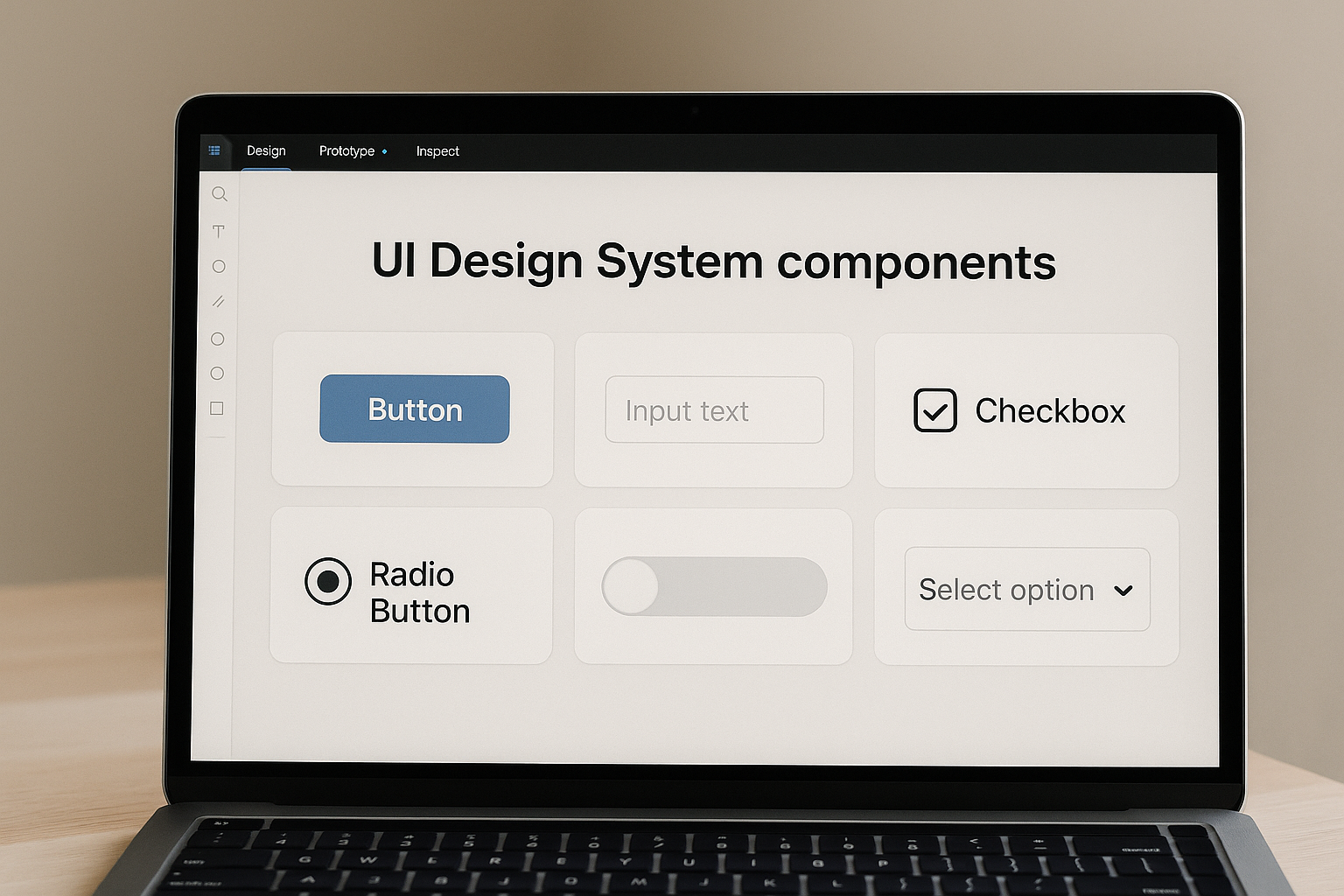
- Define 8–10 core components you’ll actually reuse.
- Document usage and states in your design tool.
- Share with product/engineering and enforce in new work.
Why WisGrowth cares: good systems reduce rework, make teams faster, and let you focus on high-value work — which is exactly how you grow your career.
Let’s make this a shipping project, not a forever project.
What is a Design System Starter?
It’s the minimum set of design rules and reusable parts that keeps your product consistent. Not a full “design ops” program. Not a giant figjam. Just enough structure to stop “Which button are we using?” discussions.
Think of it as an MVP design system you can grow later.
Why it matters (especially for small teams)
- Faster shipping: Designers stop redesigning buttons; devs stop guessing.
- Consistent UX: Users see the same patterns → less friction.
- Easier onboarding: New hires get a single source of truth.
- Career proof: “I built a system the team actually used” is a strong portfolio story.
If you're building your product and career in parallel, this is a great artifact to show in interviews. Pair it with a 7-Day Proof Sprint and you’ve got a solid case study.
How to build it in 7–10 days (step by step)
- Day 1–2: Audit & choose. Screenshot current UI, cluster by type (buttons, inputs, cards). Decide the “winning” version for each.
- Day 3: Define tokens. Set color vars (primary, surface, text), type scale (H1–H6, body, caption), spacing scale (4/8/12/16), radius. Name them clearly.
- Day 4–5: Build core components. Buttons (primary/secondary/ghost), input field, select, card, banner/alert, navbar, modal/sheet. Document hover/disabled/error states.
- Day 6: Usage guidelines. Add short notes: when to use which button, max width for cards, do/don’t for alerts.
- Day 7: Publish & socialize. Share link, record a 3–5 minute Loom walking through the system, and add it to your team’s Notion/Jira.
Optional (Day 8–10): create a code mapping file for engineering (e.g. button → component library name).
Key strategies to keep it lean
- Start from what exists. Don’t invent a visual language if the product already has one.
- Choose one tool. Figma, Penpot, whatever — but one. Fragmentation kills adoption.
- Name things cleanly. “/button/primary/medium” beats “Button Final Final (2)”.
- Document with examples. One good example clears 10 questions.
- Ship, then version. v1 can be small; keep a backlog for v2 components.
Common mistakes teams make
- Going too big first. You don’t need tables, charts, pricing cards, and timeline components on day 1.
- No owner. Pick one person as system steward (designer, PM, or design-minded dev).
- No adoption plan. Announce it, pin it, and ask teammates to use it in their next task.
- Not tying it to work. A design system nobody uses is just pretty documentation. Tie it to upcoming sprints.
Checklist: Design System Starter
- [ ] Inventory of current UI
- [ ] Token set (color, type, spacing, radius)
- [ ] 8–10 core components with states
- [ ] Usage notes / do & don’t
- [ ] Single source-of-truth link shared with team
- [ ] Owner + update cadence (bi-weekly/monthly)
Design System Starter: FAQs
Do I need to code this right away?
No. Start in your design tool so people can start using it immediately. Add code parity later.
Can I use an existing UI kit?
Yes — but customise tokens to match your brand. The point is consistency, not novelty.
How do I show this in my portfolio?
Document the before/after, show component pages, and add 2–3 screenshots of the system being used in real product screens.
Where does WisGrowth fit?
Use WisGrowth to position this as “evidence of value” in your career story — especially if you’re moving toward product, UX lead, or systems-focused roles. Pair with resume scanner to phrase it in outcome-speak.
Ship your v1 this week
Pick components, name them, document them, share them — then iterate. Momentum beats perfection.
Open Creative Zone →